A clinic whose best argument was four clicks deep
The client is a cash-based physical therapy clinic in Southern California. Sixty minutes, one-on-one with a doctor, every visit. A genuinely strong answer to "why would I pay out of pocket." On their old site that answer lived below the fold of a services page. I rebuilt seven pages into three, reverse-engineered a design system from the clinic's own social graphics, and shipped it on Wix Studio in six weeks. Consult requests went from 3 to 10 a week.
My role: designer and builder
Sole designer. I did the audit, pulled a design system out of the clinic's existing brand, drew the wireframes, and built the thing live in Wix. Three pages went up, and the clinic can edit them without calling me.
The clinic's best selling point was buried
The clinic is four people, three doctors of physical therapy and a patient success specialist, working cash-based and out-of-network. Every visitor arrives with the same unspoken question: why would I pay out of pocket for this?
The clinic has a real answer. Sixty minutes one-on-one with a doctor, every single visit, against the five to ten minutes and the hand-off to a rehab aide that defines most insurance-billed clinics. They already publish it on social, as a plain us-vs-traditional-PT comparison table.
On the old site that argument lived four clicks deep, split across a services page, a "who we help" page and an FAQ. The homepage led with a stock hero and a generic welcome.
- ✗Seven pages of overlapping content; three of them explained services.
- ✗The 60-minute claim appeared once, in body copy, below the fold.
- ✗No answer to "how much" or "do I need a referral" until the FAQ.
- ✗A multi-step contact form asking for information the clinic didn't need yet.
- ✗The footer phone number didn't dial on mobile.
- ✗Medicare acceptance, a recent change, was nowhere on the homepage.
What I learned from three competitors
Before drawing anything I scanned three PT and clinic sites for structure only: how each handled proof, density and the moment of asking. Each observation had to map onto a block the clinic needed.
Hard numbers sit right under the hero, before any narrative.
The four-up stat band: 60 min · 1×/wk · 45 days · 60–80%. Every number answers a logistics question.
Real training photos, faces mid-effort, carry the credibility.
A photo direction for the clinic: real sessions, real effort, no stock.
The cash-based objection is answered high on the page, not in an FAQ.
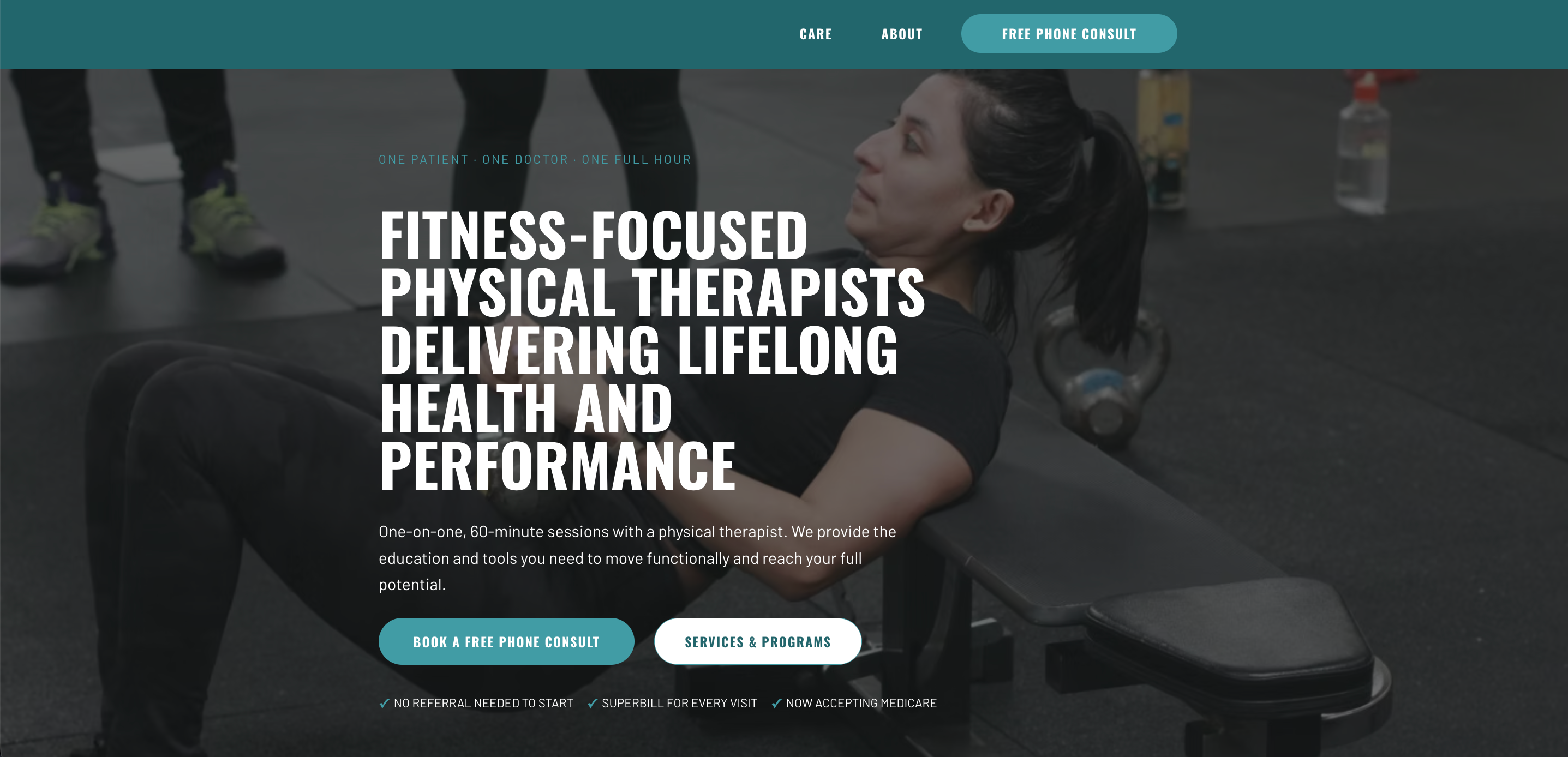
A logistics strip under the hero buttons: no referral needed, superbill every visit, now accepting Medicare.
The fourth reference was the clinic's own social graphics. Their best-performing post, the comparison table, became the homepage comparison.
A design system built from their own brand
No brand kit existed. The site was on Wix, so there was no component source and no font files. Every value was sampled from the clinic's own logo, photography and graphics, with two substitutions flagged openly so they can be swapped for the real thing.
Two brand colours with neutral greys, one bold typeface for headlines and a clean one for reading, and one layout rule every section follows. That rule is built into a single component, so the clinic can't accidentally break it. 27 reusable components in all, including the error and success states the old contact form never had.
Seven pages down to five, then to three
Wireframed in Figma at low fidelity, because the argument being tested was sequence, not styling: does the 60-minute claim land before the visitor scrolls, and can someone book without reading a services page first?
Three pages of overlapping service content collapsed into one, and the multi-step form became a single step.
Proof above the fold. Headline over a real photo, then the buttons, the reassurance strip and the key numbers: four answers before anyone scrolls.
One page for care. Services, specialties, who we help and the FAQ became one long page with anchor chips at the top.
A form that asks less. Name, contact, and what brings you in. No clinical detail and no insurance fields, nothing that turns the form into a record the clinic has to protect.
Three pages, live, editable by the clinic
Built in Wix Studio on purpose: the clinic has no developer, and a site they can't update goes stale in a month. Each section is a locked block with editable text and photos, so adding a service can't break the layout.
Hero, stat band, comparison
The offer leads: sixty minutes, one-on-one, every visit. The stat band and comparison table make the case before anyone scrolls.
Four pages merged into one
Services, who we help, conditions and the FAQ now live on one page, so the clinic has a single link to send a prospective patient.
Four people, in full
Three doctors of physical therapy and a patient success specialist, with the promise stated plainly: one-on-one, always, never a tech or an aide. At a four-person clinic, the people are the product.
More consults, fewer clicks
Consult requests went from about 3 to 10 a week after launch, booking is one click from the homepage instead of four, and the clinic can update every page themselves. Referral questions still come in by phone, so "no referral needed" has a louder home on the list for the next round.
“Sam walked us through the problems with our site. We had a lot of ideas, and it was overwhelming for us to handle. She simplified them and turned them into something streamlined and easy to find.”
What shipped, what didn't, what's next
The stat band, the comparison, Reset / Rebuild / Resilience and the teal overlay nav all came through intact. Three things did not.
The Wix theme swaps in its own font on "How we differ", "We proudly serve", and every CTA band outside Home. Home renders correctly, which makes the inconsistency visible. Fixable in the editor by reassigning the heading style.
Designed and specced, not built. The filterable blog was the piece that gave the clinic a reason to keep touching the site: worth revisiting once the three pages settle.
"Built on WIX Harmony" sits above the nav on every page. Clears with a paid plan and the domain connected: a billing step, not a design one.
The footer phone number now dials. It didn't work on the old site. The smallest finding in the audit, and the only one costing the clinic calls.